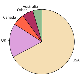
Pie chart

A pie chart is a type of chart with the shape of a pie or circle. It presents the relationship of different parts of the data. One would easily see the biggest or smallest share of the total data, by simply looking at the pie chart.
History
[change | change source]

The earliest known pie charts were in William Playfair's Statistical Breviary of 1801, in which two are used.[1][2][3]
This invention was not widely used at first.[4] The French engineer Charles Joseph Minard was one of the first to use it. In 1858 he used them in maps to add information in a third dimension.[5]

Some have said that Florence Nightingale invented it, but they were ignorant of Playfair's creation.
Nightingale was one of the first to use graphics to get important statistics to the reading public. The polar area diagram is similar to a usual pie chart, except sectors are equal angles and differ rather in how far each sector extends from the center of the circle. The polar area diagram is used to plot cyclic phenomena (e.g., count of deaths by month). For example, if the count of deaths in each month for a year are to be plotted then there will be 12 sectors (one per month) all with the same angle of 30 degrees each. The radius of each sector would be proportional to the square root of the death count for the month, so the area of a sector represents the number of deaths in a month. If the death count in each month is subdivided by cause of death, it is possible to make multiple comparisons on one diagram, as is seen in the polar area diagram used by Nightingale.
Limitations
[change | change source]
Pie charts are not the most accurate way to show data: that has been known for some time.[6] Pie charts should be used only when the sum of all categories is meaningful, for example if they represent proportions.
Pie charts are rare in scientific writing. They are more common in business and economics. One reason for this may be that it is more difficult to compare the size of items in a chart when area is used instead of length. Stevens' power law says that it is harder to see small differences using visual area than when using length. This means that length is a better scale to use, because differences can be seen more easily.
This can be shown with the image to the right. The pie chart and the bar chart have the same data. Most people have difficulty putting the slices in the pie chart in order by size from biggest to smallest. When using the bar chart, it is much easier to tell the difference between bars that are very similar in size.[7]
Notes
[change | change source]- ↑ Spence, Ian.2005. No humble pie: the origins and usage of a statistical chart. Journal of Educational and Behavioral Statistics. 30 (4), 353–368.
- ↑ Tufte, Edward R. (2001). The Visual Display of Quantitative Information. p. 44. ISBN 978-0-9613921-4-7.
- ↑ "Milestones in the History of Thematic Cartography, Statistical Graphics, and Data Visualization". www.datavis.ca.
- ↑ Spence (2005)
- ↑ Palsky, Gilles (1996). Des chiffres et des cartes: Naissance et developpement de la cartographie quantitative francaise au XIXe siecle. Comité des travaux historiques et scientifiques - CTHS. ISBN 978-2-7355-0336-0.
- ↑ Washburne J.N. 1927. An experimental study of various graphic, tabular and textual methods of presenting quantitative information. Journal of Educational Psychology. 18, 361-376 and 465-476.
- ↑ Cleveland, p. 86–87
References
[change | change source]- Cleveland, William 1985. The elements of graphing data. Pacific Grove, California: Wadsworth. ISBN 978-0-534-03730-7
- Phillip I. Good and James W. Hardin. 2003. Common errors in statistics (and how to avoid them). Wiley. ISBN 978-0-471-46068-8